
The other night I decided to play around with a few different “virtual paint” applications on the web. I’ve always gone with Sherwin-William’s Paint Visualizer (especially for our front door), but I have to say that I’ve officially converted to Benjamin Moore’s Personal Color Viewer. It really is the best if you have a picture that isn’t absolutely clear on where you want to paint. A few minutes hours later, I had about 29,837,876 options for our dining room. (Warning: this site is totally addicting!)
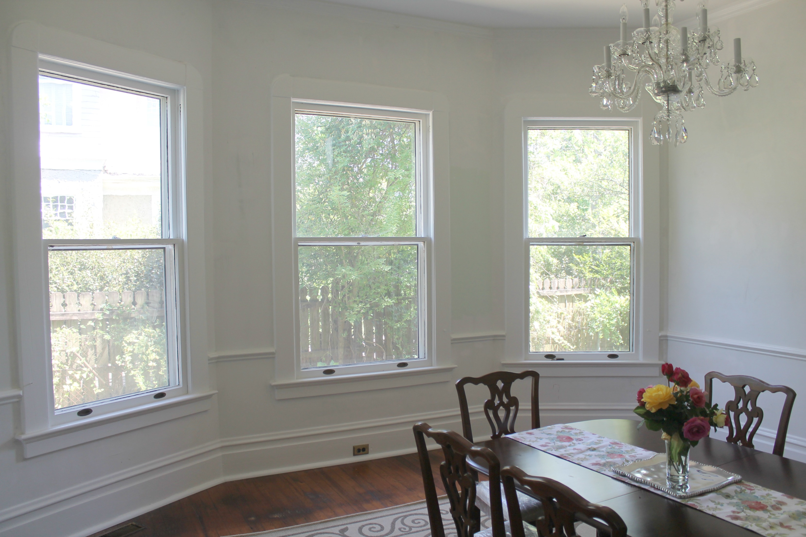
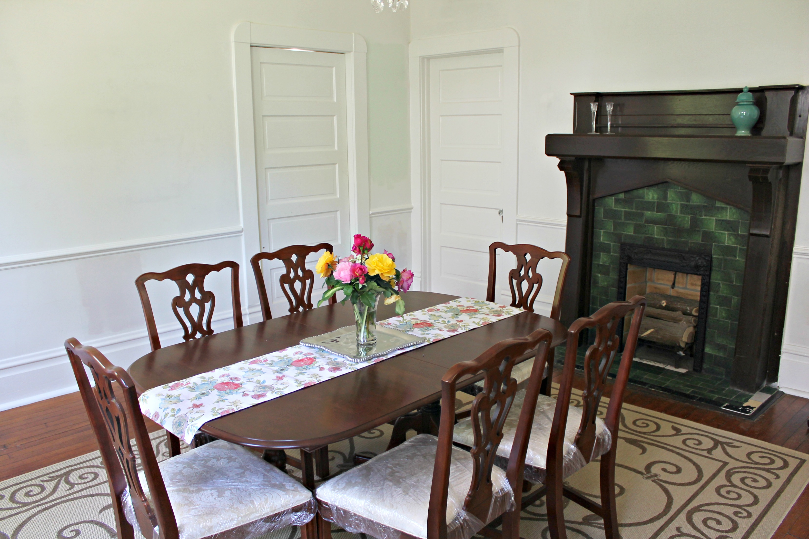
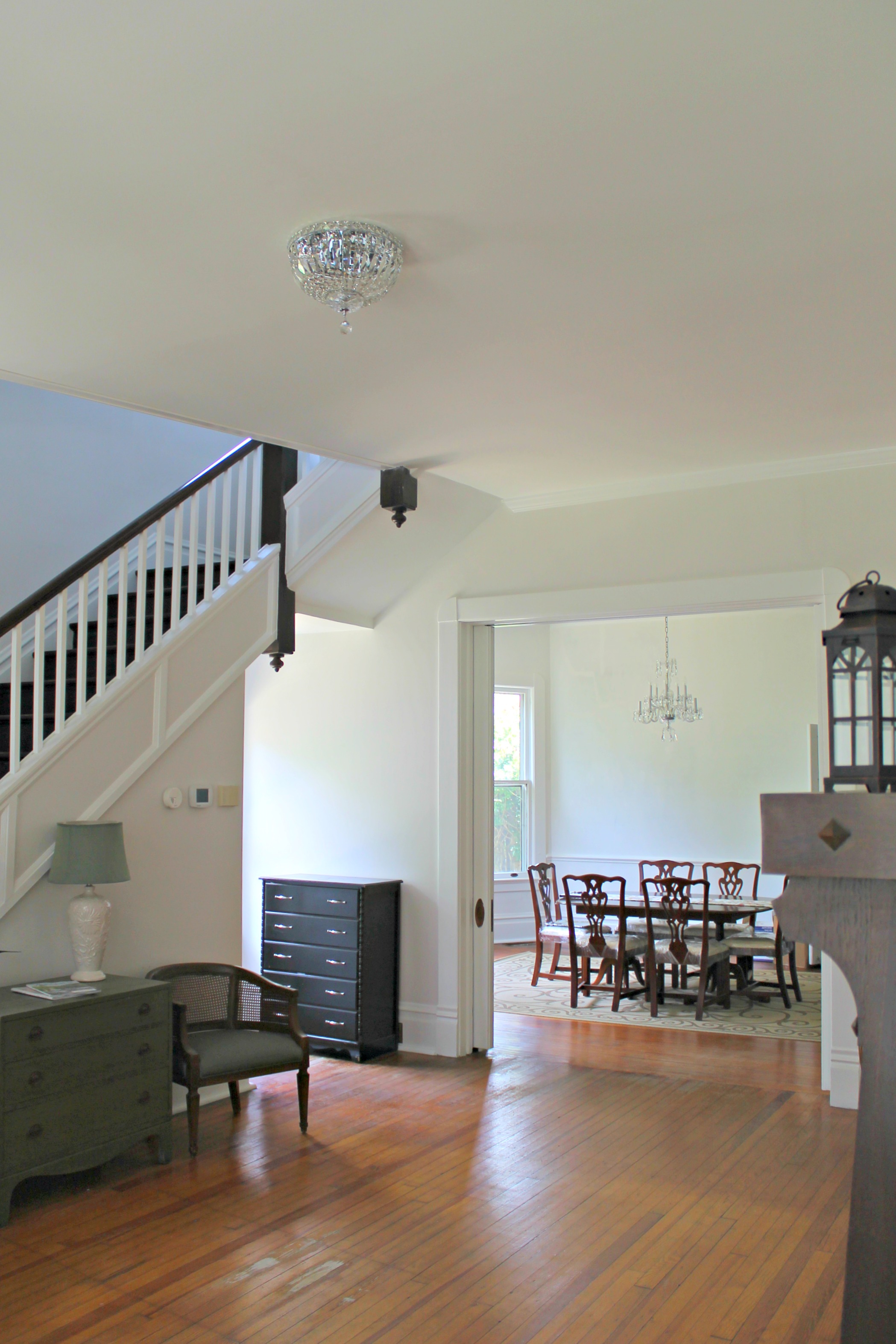
I’m just gonna put this out there: I want drama! Our house is pretty mellow for the most part, but the dining room is what you really see when you walk in the front door with the crystal chandelier, extra large windows, and massive pocket doors, and I want it to be a show stopper!
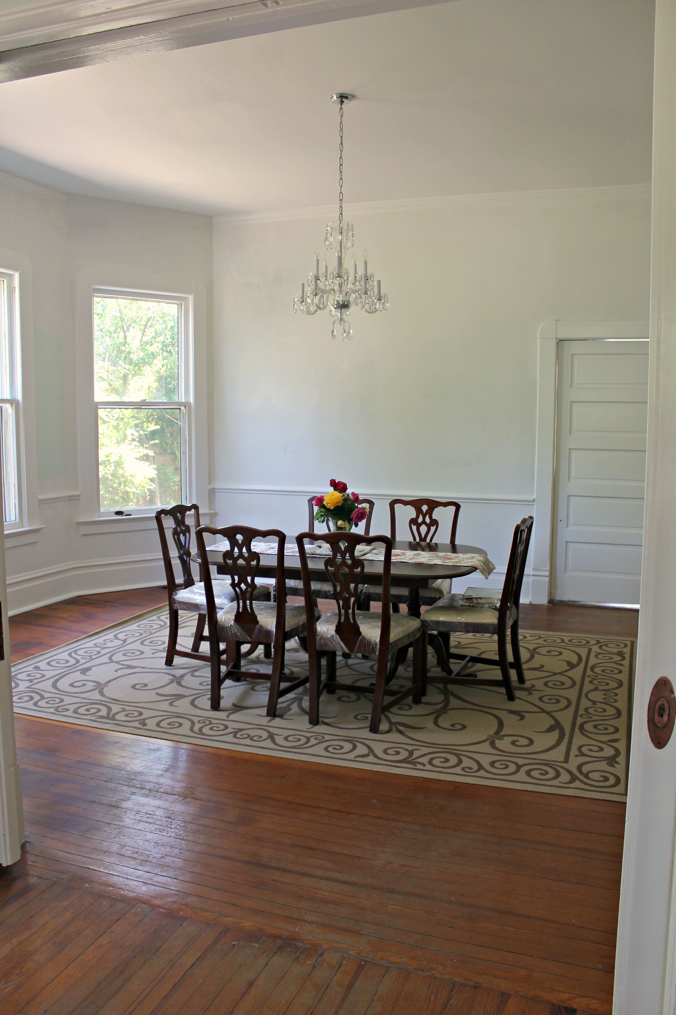
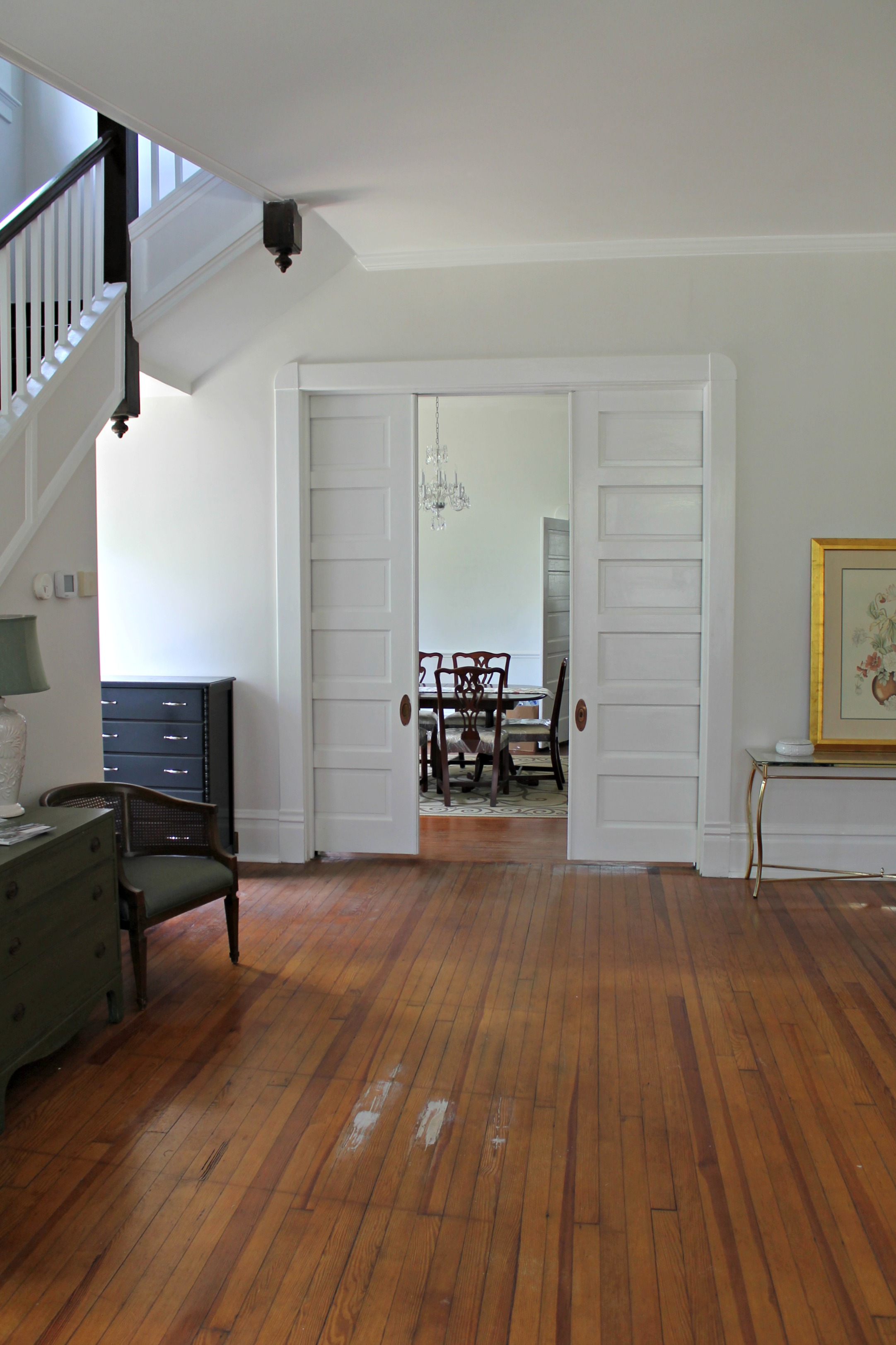
Here’s what we know:
- We have already decided that we want to do a stencil above the chair rail to add a little excitement in the room. We’ve chosen the Antoinette damask stencil and the Smoked Oyster stencil creme from Royal Design Studio, which we think will give a similar look to the wallpaper that we picked out and then realized we’d be crazy to spend that money right now!
- We want two different colors above and below the chair rail.
- The trim is staying glossy white to match the rest of the house.
- We don’t want anything too pastel.
Here’s what we’re undecided on:
- The wall color in general.
- We know we want two different colors above and below the chair rail, but haven’t decided if we want to do two colors that are a shade or two off of each other, or keep below the chair rail Kitten White to tie in to the foyer and mud room.
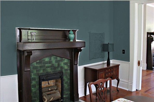
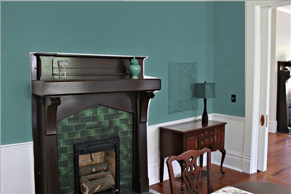
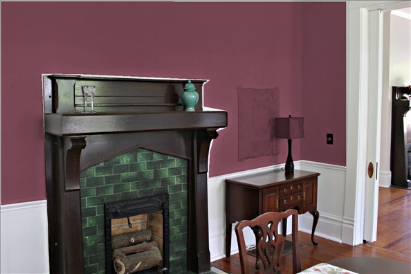
I chose to use a picture with the fireplace since that’s really the only non-changeable thing in the room. Below the chair rail is stark white primer, which we will certainly be changing.
There are lots of blues that I like, but Charles really isn’t a fan of blue, and since we’ve used it in several other rooms, I thought I’d skip the blue in here. So here are a few greens I like, in no particular order.
1. Mystic Lake
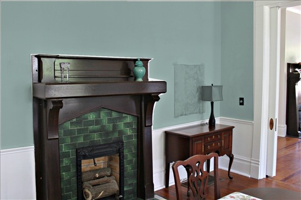
2. Yorktowne Green
3. Webster Green
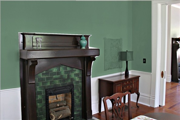
4. Antiqued Aqua
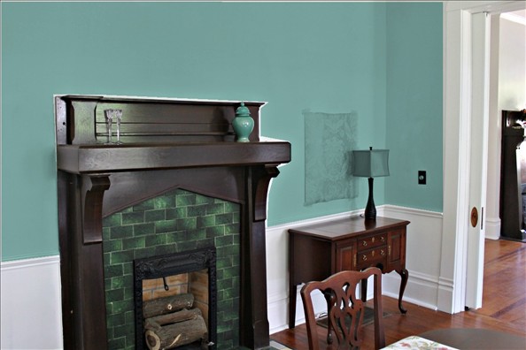
5. Tropical Oasis
When I was playing around, out of nowhere, I decided that I really love purple with the green tiles and dark fireplace trim too. A couple of favorites:
1. Wild Mulberry
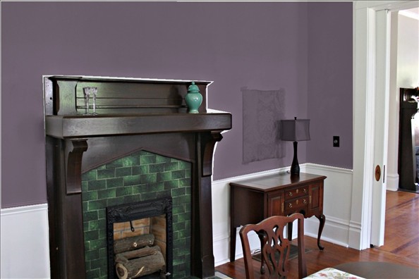
2. Carter Plum
So yeah, the possibilities really are endless.
Which one is your favorite?
I love the Yorktown Green and Wild Mulberry. Can’t wait to see what you end up choosing!
I love no. 3 Webster Green and for contrast with the fireplace, Wild Mulberry. Good luck!!!
I like #1, Mystic Lake.
Another vote for Yorktown Green or Mulberry! Definitely feels dramatic, while still suiting the age of the house.
Webster Green!
Yorktown Green for me!
Mystic Lake or Webster Green look best with the fireplace tiles…to me.
Carter Plum! I can just see the table set with touches of purple in the flowers, the dishes and even the linens. And talk about drama when you walk in the front door and are swept away by the plum walls with a large bouquet of white flowers with a few touches of purple on the dining table. I don’t think you are going to get the drama you are looking for with the greens even though they are lovely, just not special.
Webster Green for me!!!
I’m definitely going to try the online personal color viewer! I’m the worlds worst paint color picker-outer. I always think it looks great in the store, then get it home and it just isn’t the right color. We have stacks of sample paint cans in our basement! I love all the colors you chose, but I think the first one is my favorite. Your house is absolutely gorgeous by the way!!
I vote for one of the purples. Supposedly not supposed to put green in places yo eat? Has anyone else heard this or is my brain making stuff up?
Also vote for not leaving below the chair rail white. My parents’ house had this for FAR too many years and the chair rail molding blended into the bottom wall and then the baseboard stuff (we’re talking like 2+ feet total between the two. So sort of an accomplishment to hide) and it was just eh. Painted the bottom and suddenly there was definition again. Cautionary tale I guess?
Mystic Lake for me!! Good luck
Hi Sarah – new (addicted) reader to your blog :) I love #2 Yorktowne Green! I think it would add a moody, drama element and would contrast really well with the finishes in the rest of your home. Good luck!
Mystic Lake or Carter Plum! I think I like the mystic lake a bit better. It would be dramatic enough without being too jarring. But the Plum would be quite the statement! Paint colors are so hard! I have never tried BM color viewer, you’ve inspired me!
Sarah just found your blog and your home is just going to be just beautiful! If you want “DRAMA” I would chose the mulberry color. How many homes have that color in their dining room; very few. It would really make quite a statement!!! Good luck!
I LOVE the Carter Plum!
I like 1 and 4. Your mantle and bay window are GORGEOUS!
Your dining room is AMAZING!
My personal favorite color the wild mulberry!
Mystic Lake or the more lavender purple color (can’t remember the name). I can’t wait to see the pictures!